I answered this via email, but for posterity - I'm happy to accept bug fixes, features I'd encourage you to tell me more about them first because it'd depend on the scope of the feature.
Cool stuff! It's wonderful to see programs that recreate the visual style of Hypercard.
I recently built my own 1-bit drawing program, and only later discovered Strike- maybe Ditherpaint could have some inspirational ideas? I use the same internal model of "patterns as colors", but allow users to edit the patterns and create sequences of those patterns to cycle through, as a limited form of animation.
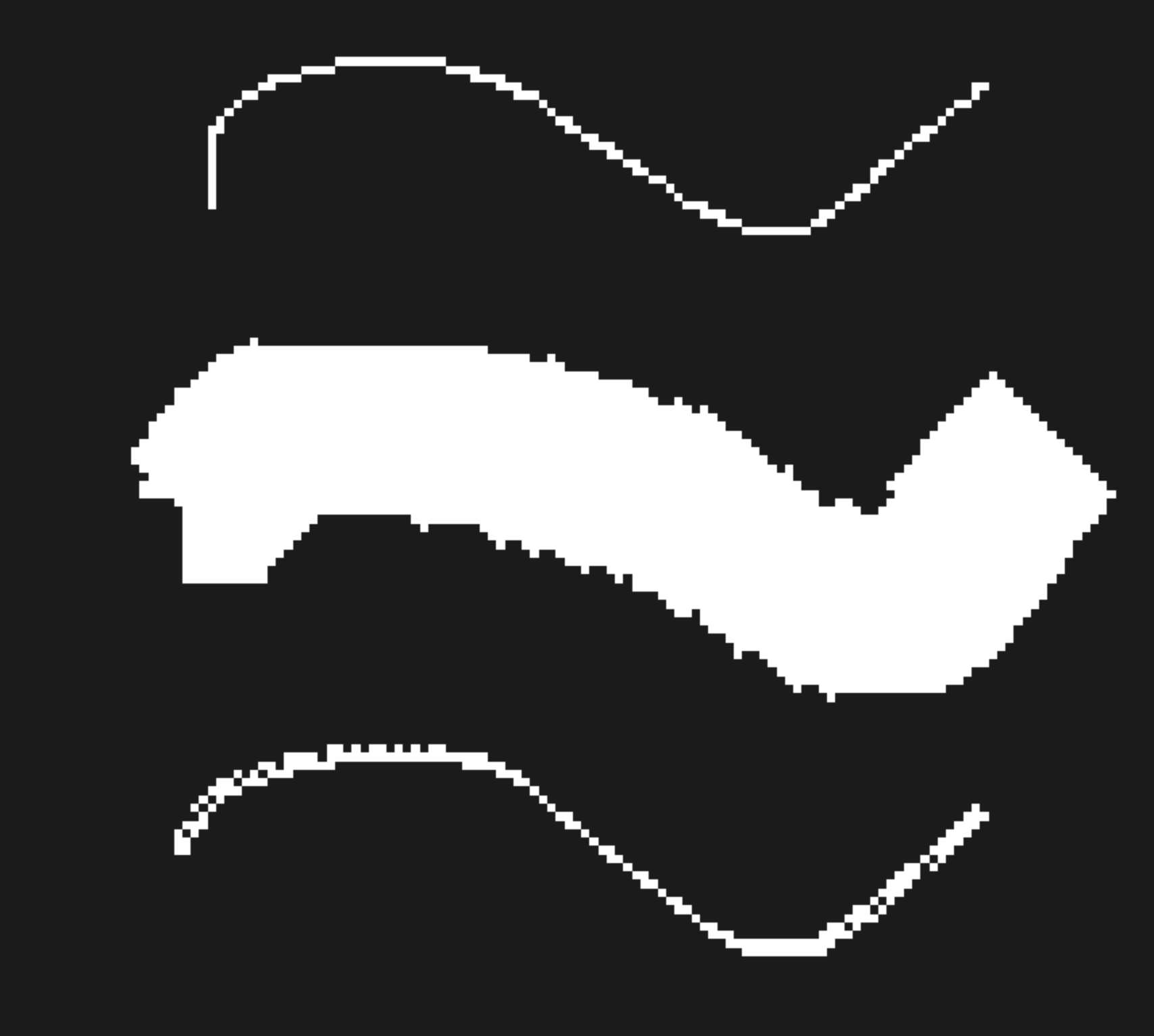
What I see is that the brush starts to draw "dirty" lines with some pixels on the side, instead drawing single pixels. Like if it was not reset to the original configuration.
Here are the steps to reproduce:
1. open a new document and zoom in
2. draw a curve with minimum brush size (1)
3. increase brush size to the maximum (20)
4. draw another curve
5. decrease brush size to the minimum (1)
6. draw another curve
In my case I see that the line of step 6 is different from step 2. Here is a screen shot of the three curves:
Nice work! One tiny, tiny suggestion: for the very first use of the tool, it might be worth defaulting the brush size to something larger than 1, because a 1-pixel-sized brush doesn't really show off the patterns much. A small thing, but might make it fractionally easier to grasp.
Really nice controls! It would be cool to have an opacity option too (e.g. all black on all white at 50% opacity would result in the middle dot pattern)
← Return to tool
Comments
Log in with itch.io to leave a comment.
I’m wondering if you’d accept pull requests on this? As I notice it’s on your old/unused GitHub account.
I answered this via email, but for posterity - I'm happy to accept bug fixes, features I'd encourage you to tell me more about them first because it'd depend on the scope of the feature.
very fun to use :)
awsome
dunno if it was intended but with a touch screen you can make cool patterns with two
or more fingers on the screen
Cool stuff! It's wonderful to see programs that recreate the visual style of Hypercard.
I recently built my own 1-bit drawing program, and only later discovered Strike- maybe Ditherpaint could have some inspirational ideas? I use the same internal model of "patterns as colors", but allow users to edit the patterns and create sequences of those patterns to cycle through, as a limited form of animation.
Brings up memories of an Atari ST with 640x480 monochrome display. I like those greyscale patterns.
Interesting tool. Any chances for the steam version?
Steam version is unlikely, as this is a web-based app and I don't know how to wrap that up for Steam and get it onto the marketplace.
WOW, is this cool.
Now I want to try this for adapting some sketches I have around.
You can get this look with other softs, right, but this is quick and easy to use.
If you're going to add anything else, I'd recommend a circle - square - vector tool to get bigger surfaces painted quicker.
Very cool!!
Just for your info, there is a small bug with the brush when you increase its size and then decrease again.
Anyway, congrats for the project! :)
Thank you!
Re: the bug - what kind of issue are you seeing when you change brush size? I haven't noticed anything myself, but I'm also not sure what to look for.
Hey, I'm sorry if I was too vague.
What I see is that the brush starts to draw "dirty" lines with some pixels on the side, instead drawing single pixels. Like if it was not reset to the original configuration.
Here are the steps to reproduce:
1. open a new document and zoom in
2. draw a curve with minimum brush size (1)
3. increase brush size to the maximum (20)
4. draw another curve
5. decrease brush size to the minimum (1)
6. draw another curve
In my case I see that the line of step 6 is different from step 2. Here is a screen shot of the three curves:

This should be fixed now! Thank you for the detailed bug report.
Nice work! One tiny, tiny suggestion: for the very first use of the tool, it might be worth defaulting the brush size to something larger than 1, because a 1-pixel-sized brush doesn't really show off the patterns much. A small thing, but might make it fractionally easier to grasp.
Really nice controls! It would be cool to have an opacity option too (e.g. all black on all white at 50% opacity would result in the middle dot pattern)
love love love this! any plans for key mapping some of the controls? esp. the brush size and stuff? really nice!
Thanks for ur job;)